Finding where I stand in the Data Science world by web scraping job openings
A fun exercise in text analytics on job postings and a resume, starring tf-idf and t-SNE, to find which data role actually suits my profile best.
Originally published on Towards Data Science. Lightly reformatted for this site.
There is considerable debate about what the actual job of many of the “data science” job titles consists of. As a Data Scientist it’s very confusing to look at job postings that range from analysts to scientists to engineering roles, knowing that the actual job description might vary wildly from your understanding of the role. This mismatch gave me an existential crisis upon graduation and many restless nights since. Am I a Data Scientist? A Machine Learning Engineer?
Do I even belong in data science?
Combine this with the fact that many companies have no idea of what kind of data professional they really want to hire, and you’ll see why data science job descriptions can be all over the place.
My goal is simple. Can I scrape job postings online, group them by title, and see if I can get some meaningful visualization that tells me where I have ended up in the landscape? Can I find where I belong?
Act I: a story of a web scraper
To start I collected data science job titles. To spice things up I also included statisticians and quantitative analysts. By no means complete, the below list holds the terms that I scraped for:
- Data Scientist
- Data Engineer
- Data Analyst
- Machine Learning Engineer
- Statistician
- Quantitative Analyst
- Research Scientist
Obviously it’s a little bit of a flawed list. There are many more titles and my choice is a bit arbitrary. The top five are relatively common terms, while the bottom two are slightly more uncommon. I decided to stick with these as a proof of concept.
I decided scraping indeed.com with the Python libraries requests and beautifulsoup was my best bet. After looking at the site and playing around with the user interface, I figured that I would be good to go by collecting links to individual job descriptions first, and then look them up one by one.
jobtitles = []
urls = []
jobclass = []

for term in titles:
    startlen = len(urls)
    try:
        r = requests.get('https://www.indeed.com/jobs?q={}&sort=date&limit=50'.format(term['urltitle']))
        soup = BeautifulSoup(r.text, 'html.parser')
        count_str = soup.find('div', id="searchCountPages").get_text()
        max_results = int(count_str.split()[3].replace(',', ''))

        # calculate how many pages we need to query
        max_results = math.ceil(max_results / 50)
        time.sleep(1)  # pause for 1 second
    except Exception as e:
        print(f'error: {e}')

    print('Querying {} pages for {}'.format(max_results, term['title']))
    for x in range(0, max_results):
        try:
            split = '&start=' + format(x * 50)
            html = requests.get('https://www.indeed.com/jobs?q={}&sort=date&limit=50+{}'.format(term['urltitle'], split))
            soup = BeautifulSoup(html.text, 'html.parser')
            for link in soup.findAll('a'):
                try:
                    if term['title'].lower() in link.attrs['title'].lower():
                        jobtitles.append(link.attrs['title'])
                        urls.append(link.attrs['href'])
                        jobclass.append(term['title'])
                        storedescription(term['title'], link.attrs['href'])
                except:
                    print(f'error: {e}')
            time.sleep(1)
        except Exception as e:
            print(f'error: {e}')

    print('.. found {} results for {}'.format(len(urls) - startlen, term['title']))
The above snippet does that by first collecting the number of descriptions available and collecting them 50 links at a time. Because Indeed.com automatically matches you with unrelated or semi-related postings, I built in a check to only continue if the job title was actually a part of the job posting. The call to storedescription() only scrapes the actual job description and stores it to a text file.
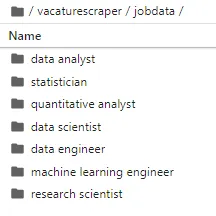
I’ll skip some of the details, but the most important thing is that this gave me a list of job titles and several folders that contained the plain-text job descriptions. Between these seven folders, I had 577 text documents.
Act II: making sense of job postings
Excitedly, I opened one of the job postings. The text was mostly all right by the courtesy of beautifulsoup, but there was still some limited pre-processing to do. Some of the sentence endings were going bad, which would be a problem that should be addressed prior to tokenization.
To clean this up I added a quick and dirty pre-processing script.
def preprocess(line):
    line = line.replace('\n', ' ')  # newlines
    line = line.replace('[', ' ')
    line = line.replace(']', ' ')
    line = line.replace(':', ' ')   # we don't need summaries, just give me tokens
    line = line.replace('\t', ' ')  # tabs

    # converts line endings in a way that stops the accidental camelcasing
    # but leaves terms like SAP intact
    line = re.sub(r'([a-z](?=[A-Z])|[A-Z](?=[A-Z][a-z]))', r'\1 ', line)

    # regex to address the issue of text continuing directly after a period
    # instead of a space
    line = re.sub(r'\.(?! )', '. ', re.sub(r' +', ' ', line))
    return line
I was a bit worried on how to proceed. I wanted to plot the descriptions as classes with t-SNE. I routinely work with high dimensional data, but often it’s in the form of word embeddings and tensors. Long and sparse vectors scare me. If I take just a simple bag-of-words vector for each document I would have one giant vector which might be troublesome. Using tf/idf might alleviate some of the issues with common terms, but it doesn’t reduce the dimensionality of my data. I figured I would proceed with SVD, but it felt like there should be an easier route towards the kind of visualizations that I wanted.
Then I found Yellowbrick, a library for Machine Learning Visualizations designed to supplement Scikit-Learn. With Yellowbrick I could do SVD and t-SNE in a single line as follows:
from sklearn.feature_extraction.text import TfidfVectorizer, CountVectorizer
from yellowbrick.text import TSNEVisualizer

# get a vectorizer
tfidf = TfidfVectorizer(stop_words='english')

# fit and transform the vectorizer on the descriptions we collected earlier (list)
X = tfidf.fit_transform(description)

# the labels are just the job title we used as a search term
y = labels

# create the visualizer and draw the vectors
tsne = TSNEVisualizer(decompose_by=75, decompose='svd', colormap='tab20')
tsne.fit(X, y)
tsne.show()
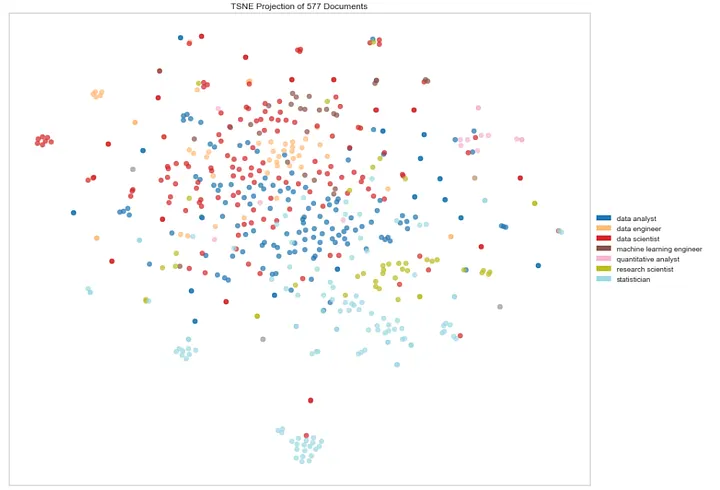
Which results in the following visualization based on 577 documents (= 577 job postings):

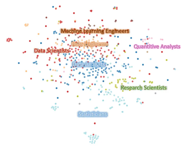
For the sake of clarity I’ve edited the names of the classes into the image below.
What this shows is quite amazing. The statisticians are pretty much clustered together with the odd data scientist or analyst being close. Interestingly the research scientists are distinctly identifiable as a neighboring cluster. This shows these jobs are probably fairly related, but still distinct enough to be seen as separate clusters. Go research scientists!
It’s almost like a spectrum. The middle ground is occupied by data analysts who bridge the gap between Statisticians and Data Scientists. The Data Scientists and the Data Engineers are fairly mixed, with the Engineers having some consolidated ground. The Machine Learning Engineers seem to orbit the Data Engineers more than the Data Scientists. Small clusters of the Data Scientists appear at the edge, which might indicate separate flavors of data science. Really though, Data Scientists as a role seem to be pretty much all over the place.
The Quantitative Analysts form their own cluster at the edge of the map. This was to be expected since it’s a fairly unique niche. What is interesting is that they’re joined by a couple of Analysts and Scientists. It could indicate that those looking for Quantitative Analyst positions should also consider looking at Data Science and Data Analyst postings.
Act III: where do I belong?
The landscape is clear, but where do I belong? Since I already have text descriptions of job postings as my data, all I really need is to put my resume in a similar plain-text format and add it to a folder. I can then simply run the script once more to find out where I am.

Unfortunately, there’s a random element associated with t-SNE and I can’t recreate the same plot when I run the script again. However, the general orientation of the data should be the same. That is, the clusters should appear in more or less the same position relative to each other but in different orientations and locations.
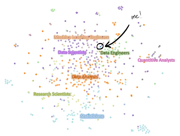
A quick re-run of the script shows my resume wedged between Data Engineering, Machine Learning Engineering, and Data Scientist. A bit more on the engineering side of the spectrum perhaps. I have several Software Engineering internships and projects on my resume, so this makes some sense. Unfortunately, I’m smack in the middle of the disputed area between all the different disciplines. The nearest neighbors are several Data Science vacancies, two ML Engineering vacancies, and the proximity of a cluster of Data Engineers.
That’s it for now. I enjoyed writing about this fun exercise. Of course this is a far cry from a “proper” approach, and I would advise not to get too hung up on the results if you reproduce it.